Private · prepared for FRANK
Brand Showcase

Brand showcase for FRANK

A handful of projects, curated to show solutions to problems like yours: from the story a company tells to the way it looks, works, and shows up in a room.

Prepared by Ed · July 2026 · Private link

Every project here started as a business problem, not a design brief.

So each one is laid out the same way: the problem, the strategy behind the answer, and the solution it produced. Read the thinking, not just the pictures.

I. KORE

Identity & Print
Problem

Kore is a boutique firm specialised in tax law, a field dominated by antiquated conventions where every practice looks and sounds alike. Kore had re-engineered how a firm actually works, pairing top legal talent with creative thinking, but its identity said none of that. It needed to signal real sophistication and speak to current and future generations.

Strategy

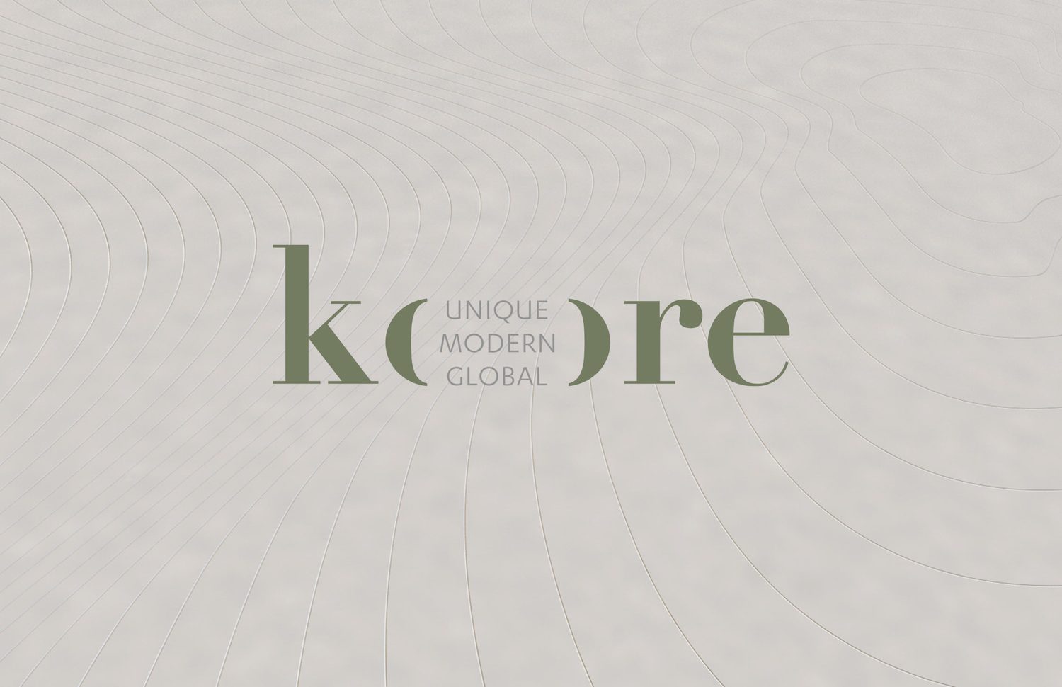
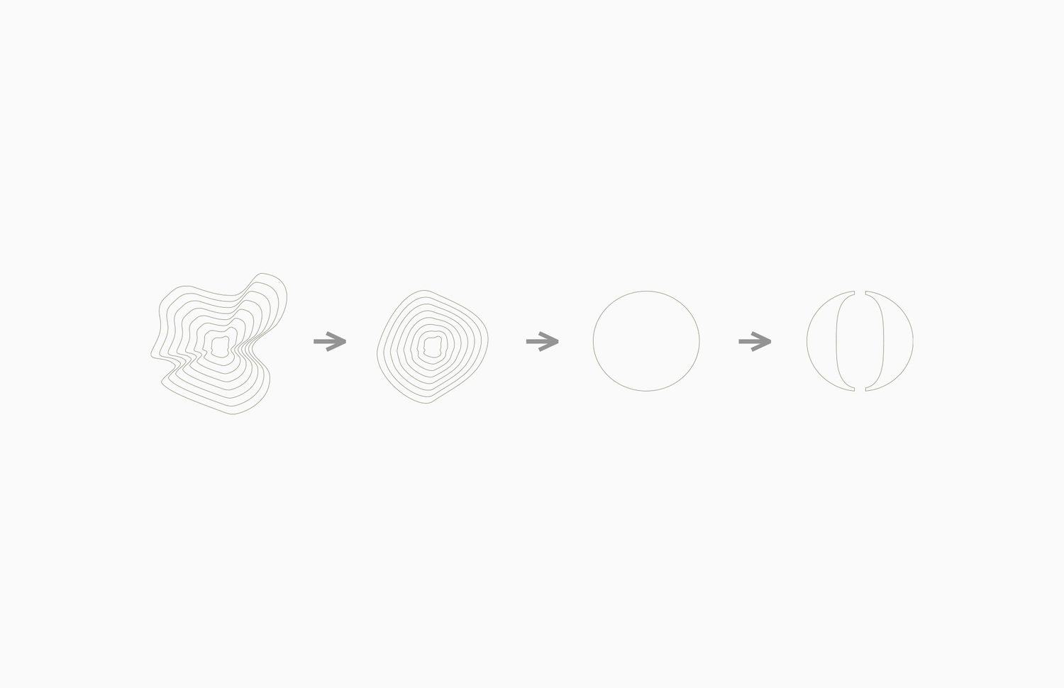
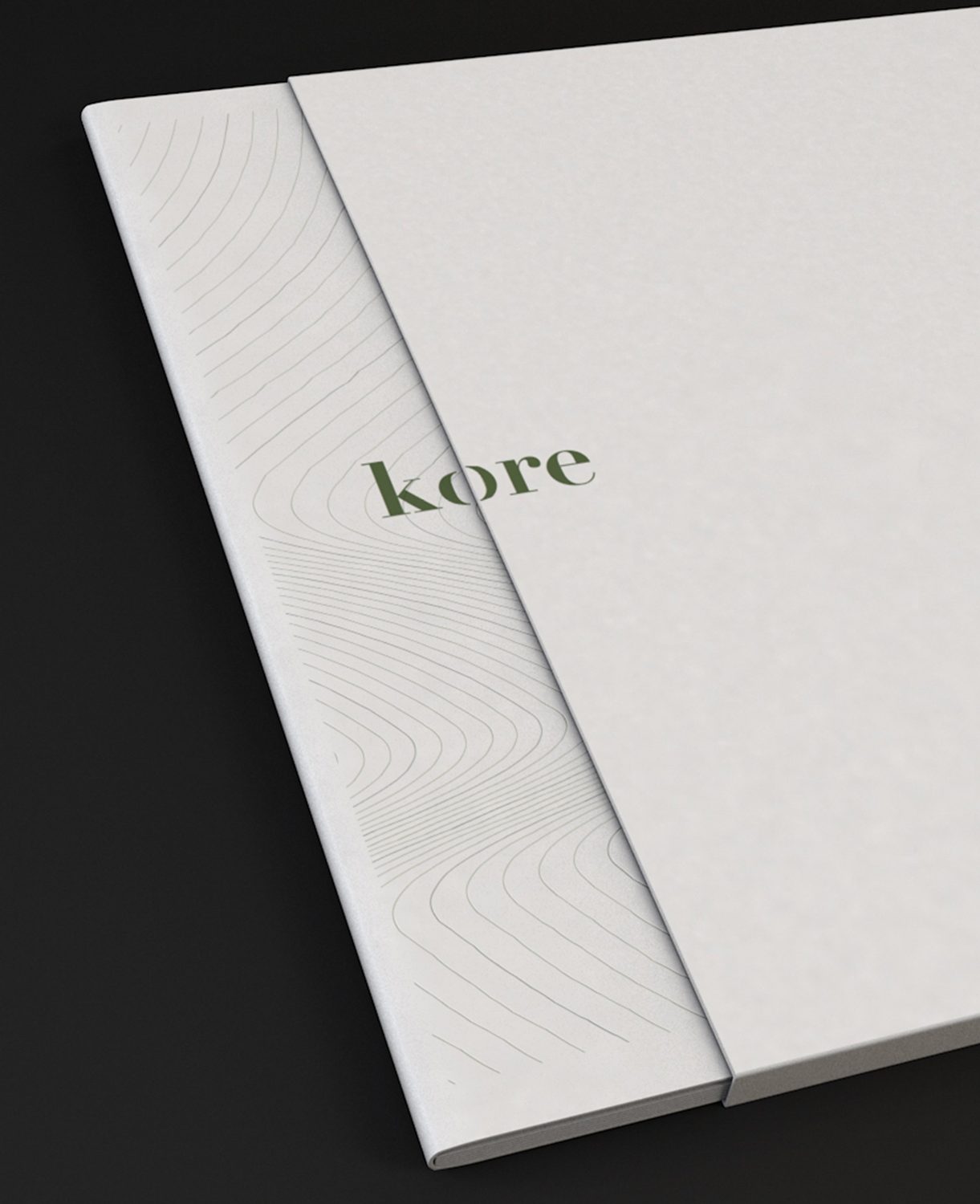
Build the brand from one ownable idea rather than a mark. A generative “core” motif, concentric contour lines drawn from the name, became the system. It reads as depth, precision and reach, and flexes across every touchpoint without ever repeating. Strategy first: every design decision traces back to it.

Solution

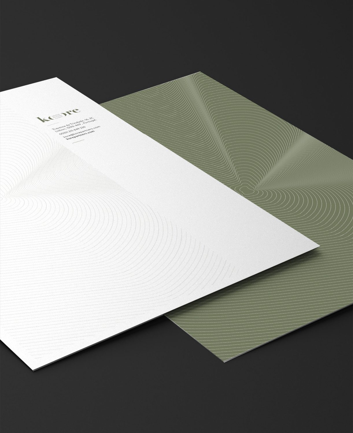
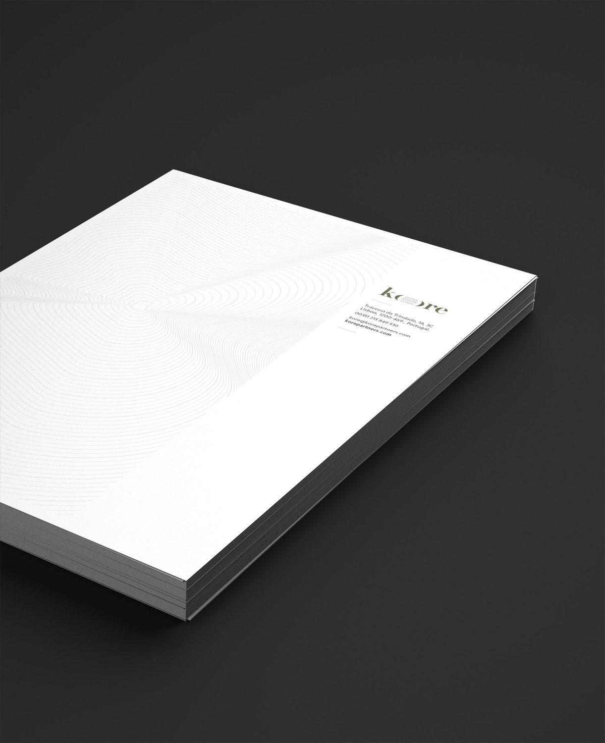
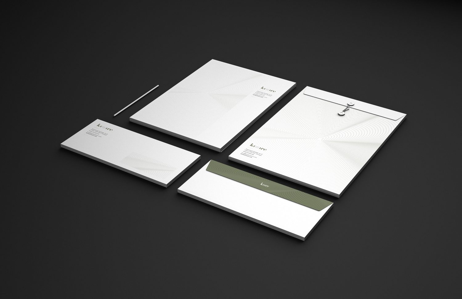
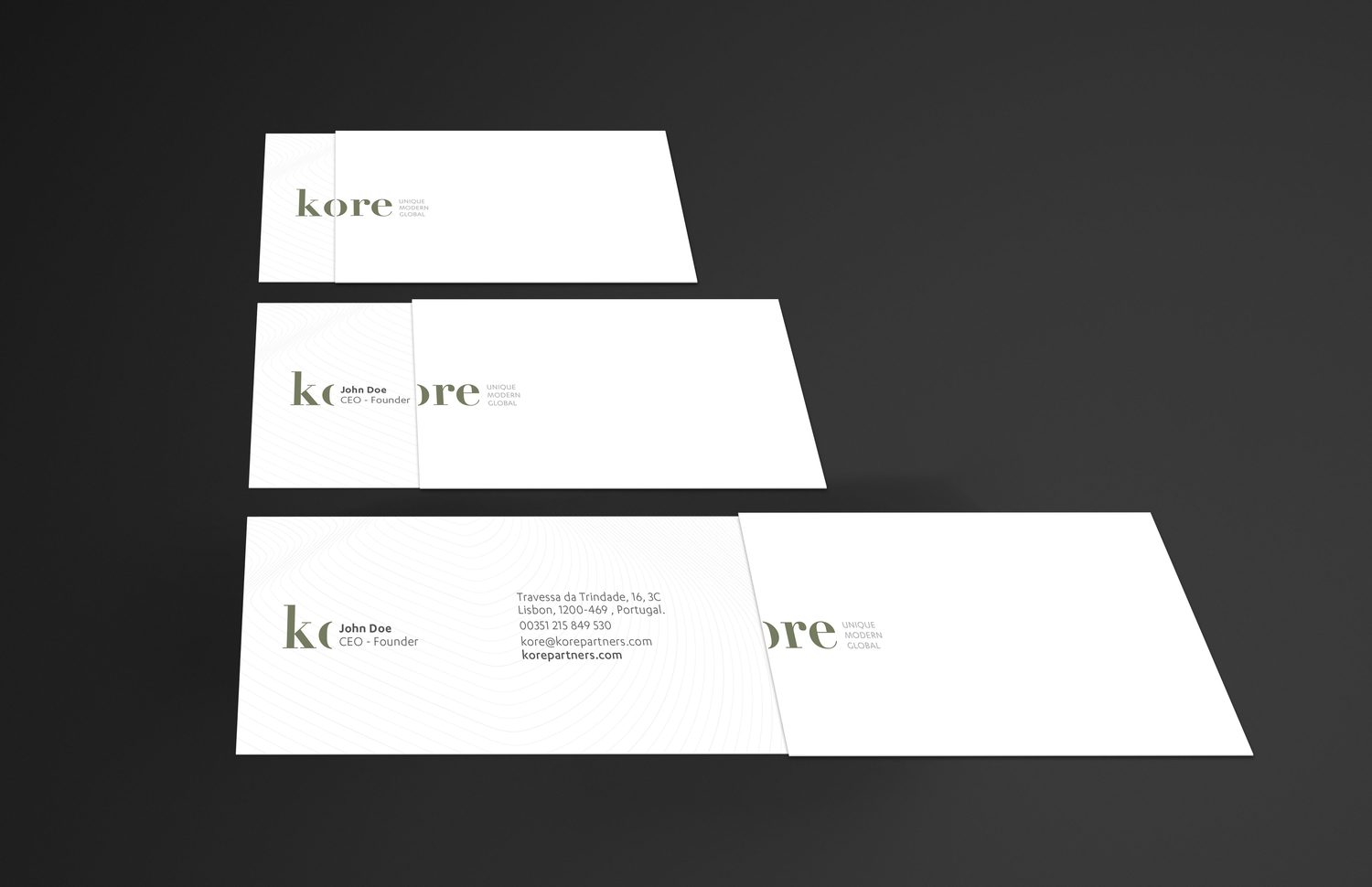
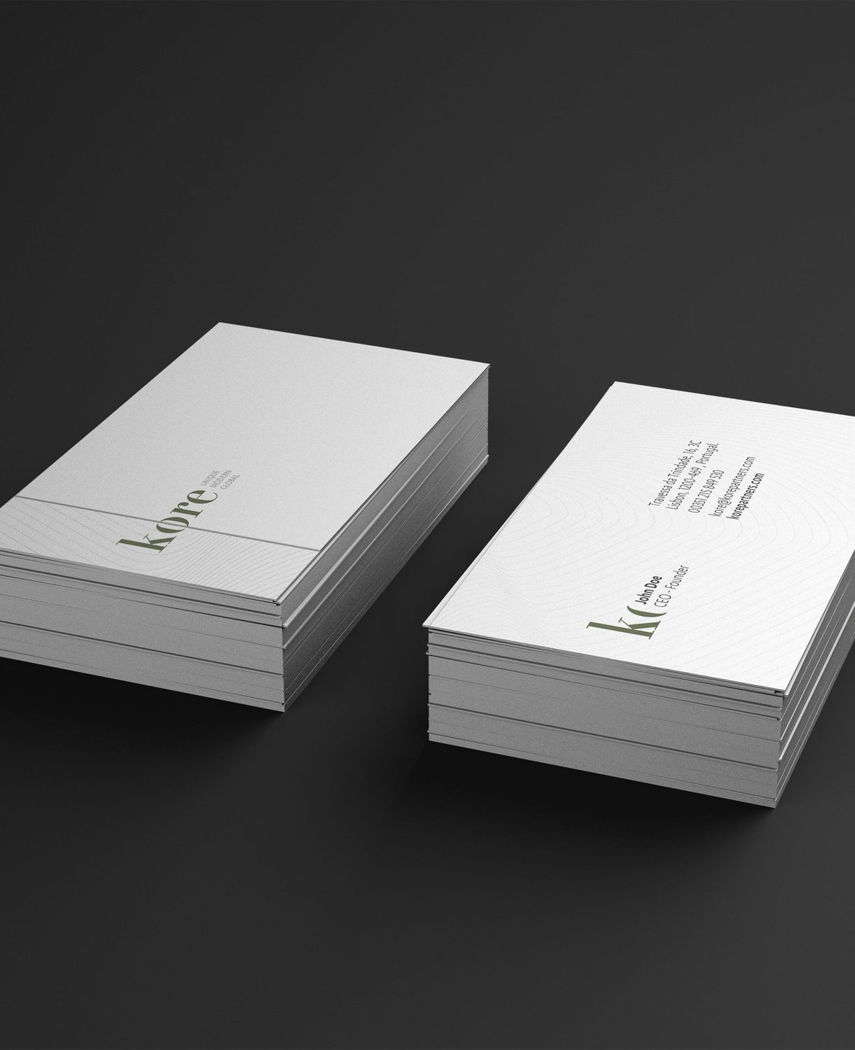
A refined wordmark whose “O” holds the generative core, a restrained sage-and-stone palette, and a full identity system covering stationery, business cards, folders, a brochure and the website UI, all carrying the line motif. Modern, systematic, unmistakably Kore.

Scope
  • Brand Strategy
  • Logo Design
  • Art Direction
  • Print & Stationery
  • Web / UX/UI Design
  • Presentation Design
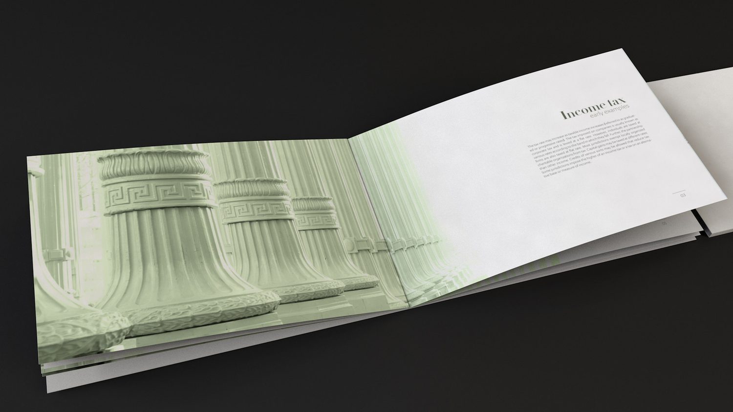
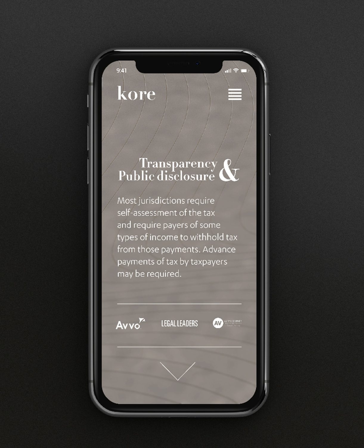
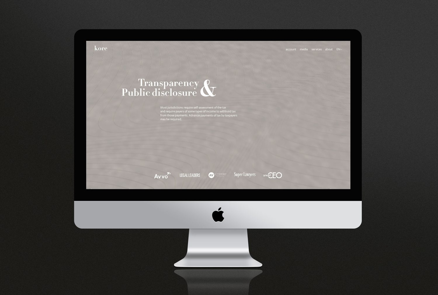
KORE wordmark on the signature contour-line texture Logomark construction — concentric contours resolving into the core symbol Letterhead system Letterhead, detail Full stationery system — letterhead, card and envelope Business card — front and back layout Business cards Presentation folder carrying the core motif Brochure spread with the sage line motif Brand key visual — unique · modern · global Responsive site — mobile Website — desktop
ResultA boutique at the “unsexy” end of professional services that now looks anything but. Sophisticated, distinct, and built to speak to the next generation of clients.
II. Nectaroo

Messaging & Strategy
Problem

Nectaroo was an idea before it was a brand. A Lisbon subscription delivering fresh, seasonal fruit in ready-to-eat forms (cubes, juices and popsicles), with by-products made from fruit that would otherwise be thrown away. Entering a market of grocery stores and generic snack boxes, it had no story, no positioning, and no reason for anyone to believe that “fruit delivery” was worth subscribing to.

Strategy

This one was strategy first, design second. The whole brand was built on paper before a single visual: a positioning around “nature’s candy,” five core values, five audience personas, a full messaging framework running from pain points to functional, emotional and values-based benefits, and a brand narrative that carries the customer from a compromised old world to a better new one. The personality landed as a warm, reliable, eco-conscious friend.

Solution

With the thinking locked, the rest followed. The name Nectaroo, a sharp value proposition and the tagline (“Nature’s candy. Delivered.”), a messaging system the brand can speak in consistently on any channel, and a visual identity pulled straight from the product: a minimalist fruit logomark, the friendly geometric Daxline Pro, and a high-contrast colour system drawn from fruit itself, with a secondary palette built for range.

Scope
  • Brand Strategy
  • Communication Strategy
  • Naming
  • Tagline
  • Logo Design
  • Art Direction
  • Packaging
  • Print / OOH
  • UX/UI Design
  • Motion Design
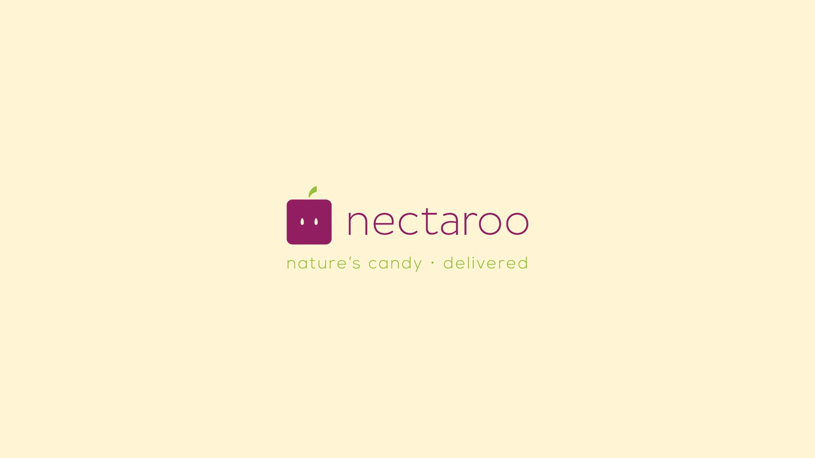
Nectaroo logo, nature's candy delivered
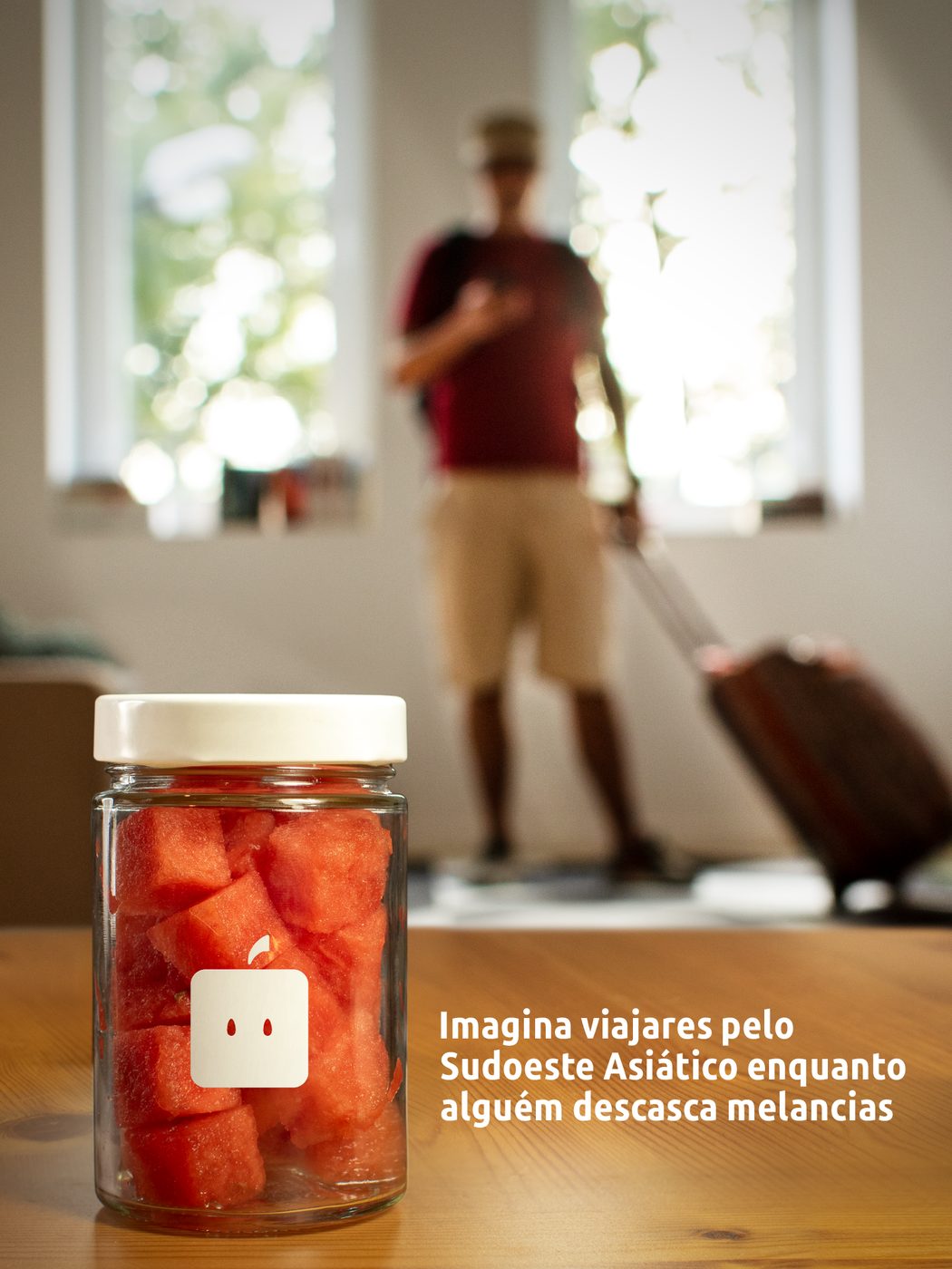
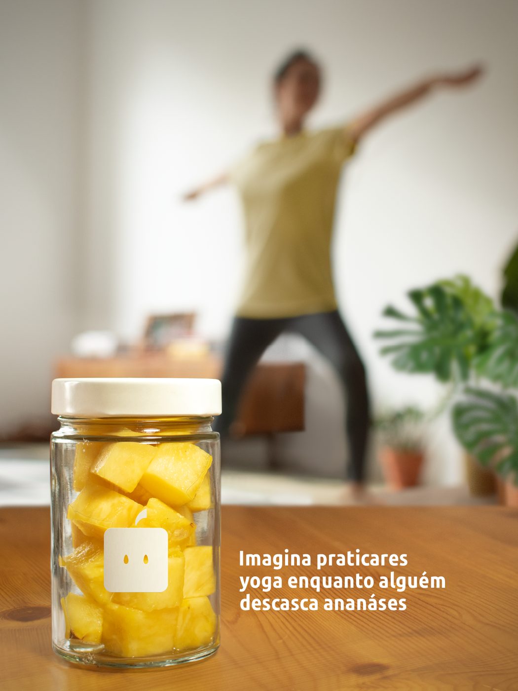
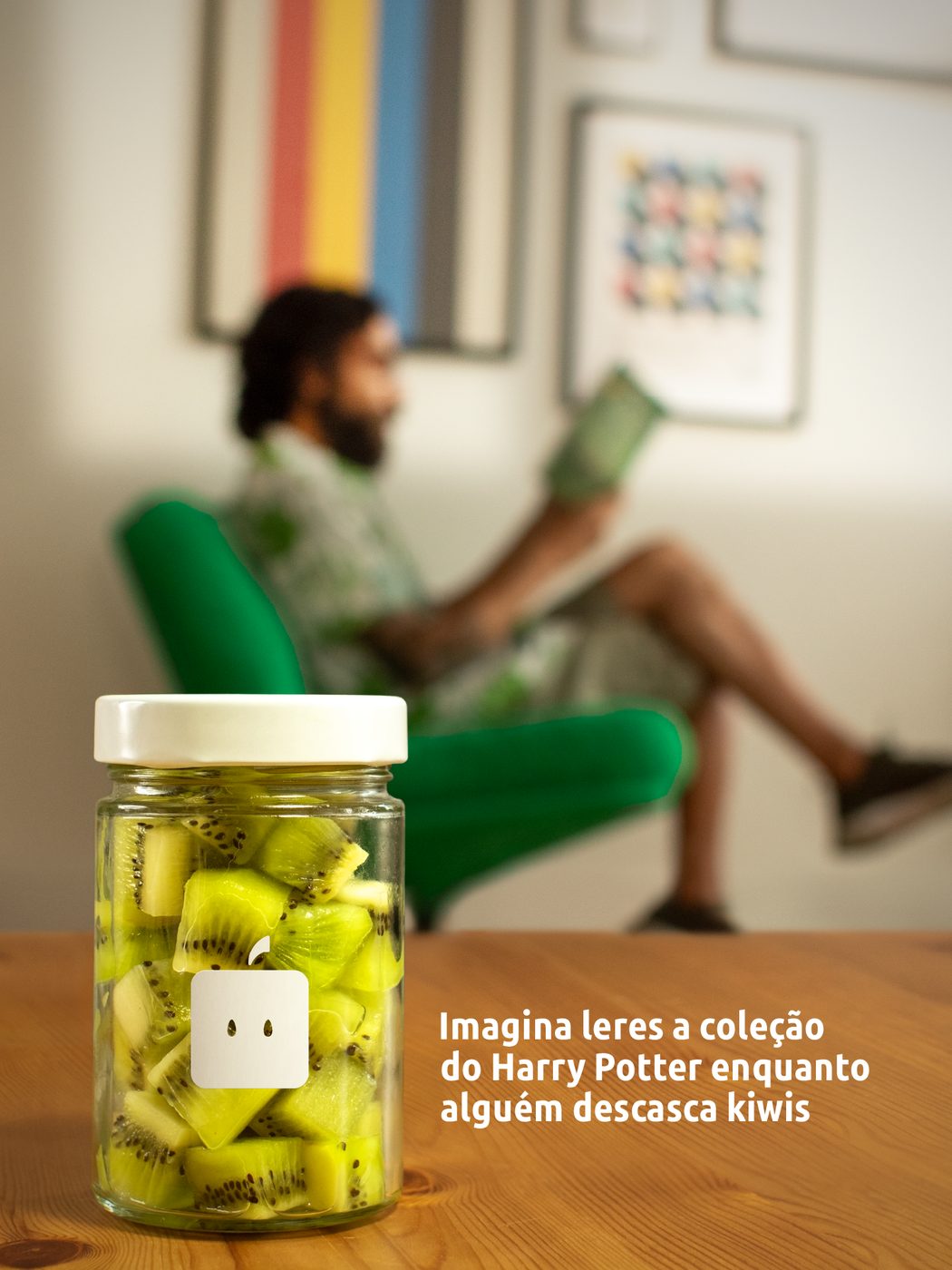
Campaign ad, watermelon Campaign ad, pineapple Campaign ad, kiwi
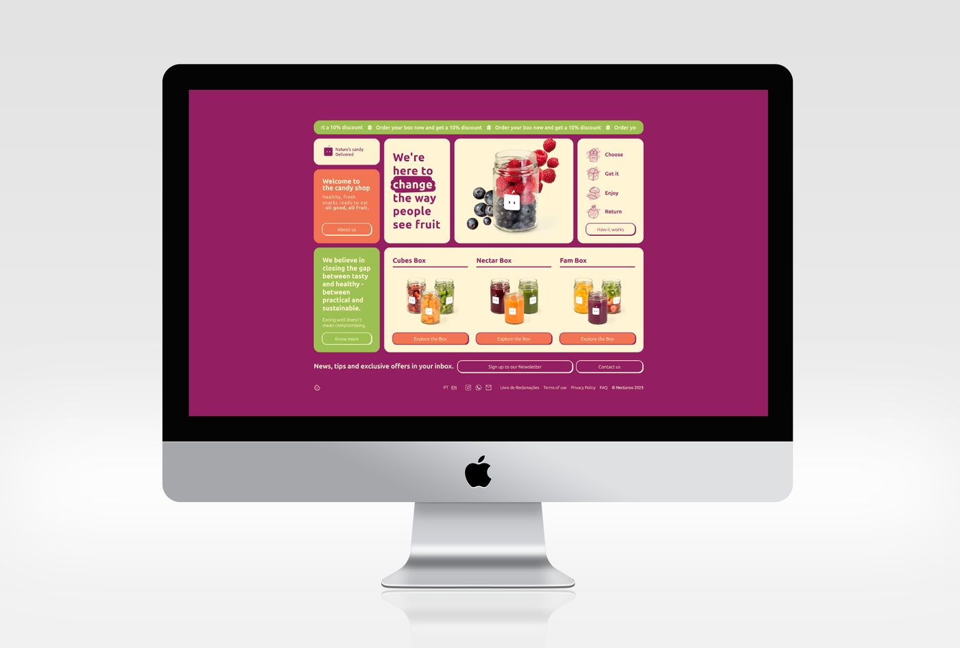
Website, desktop
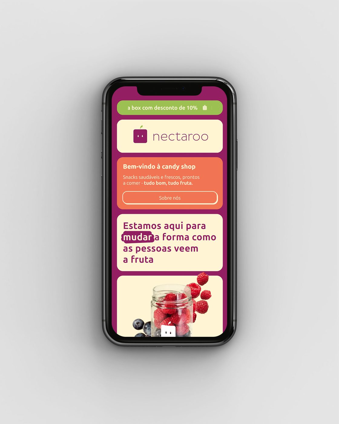
Website, mobile Website, mobile, second screen
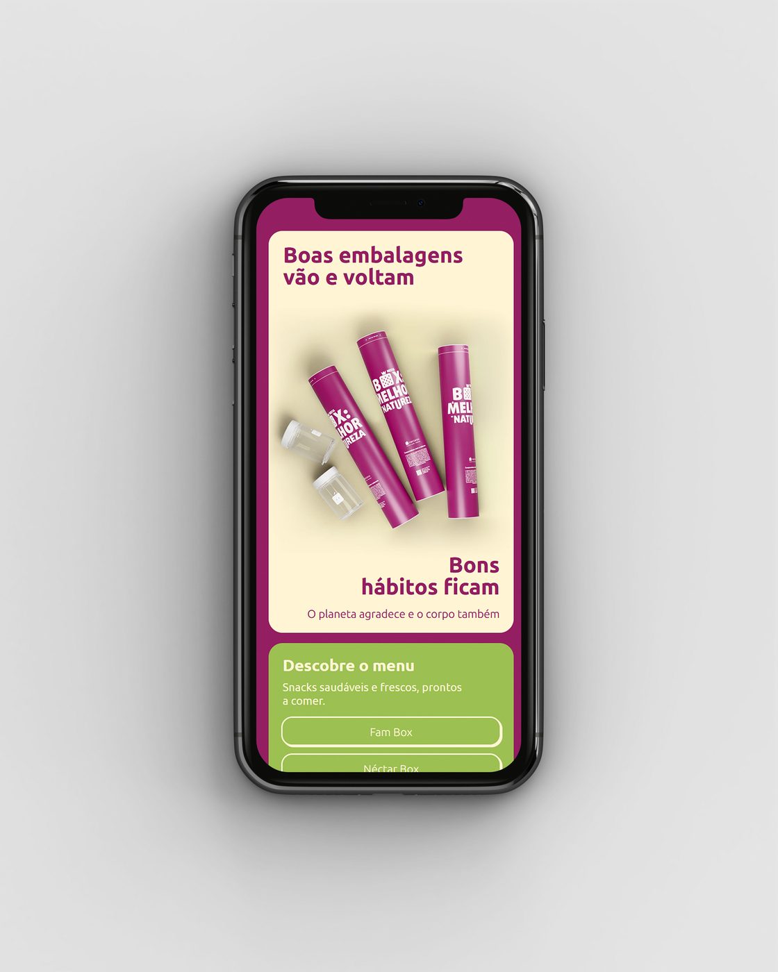
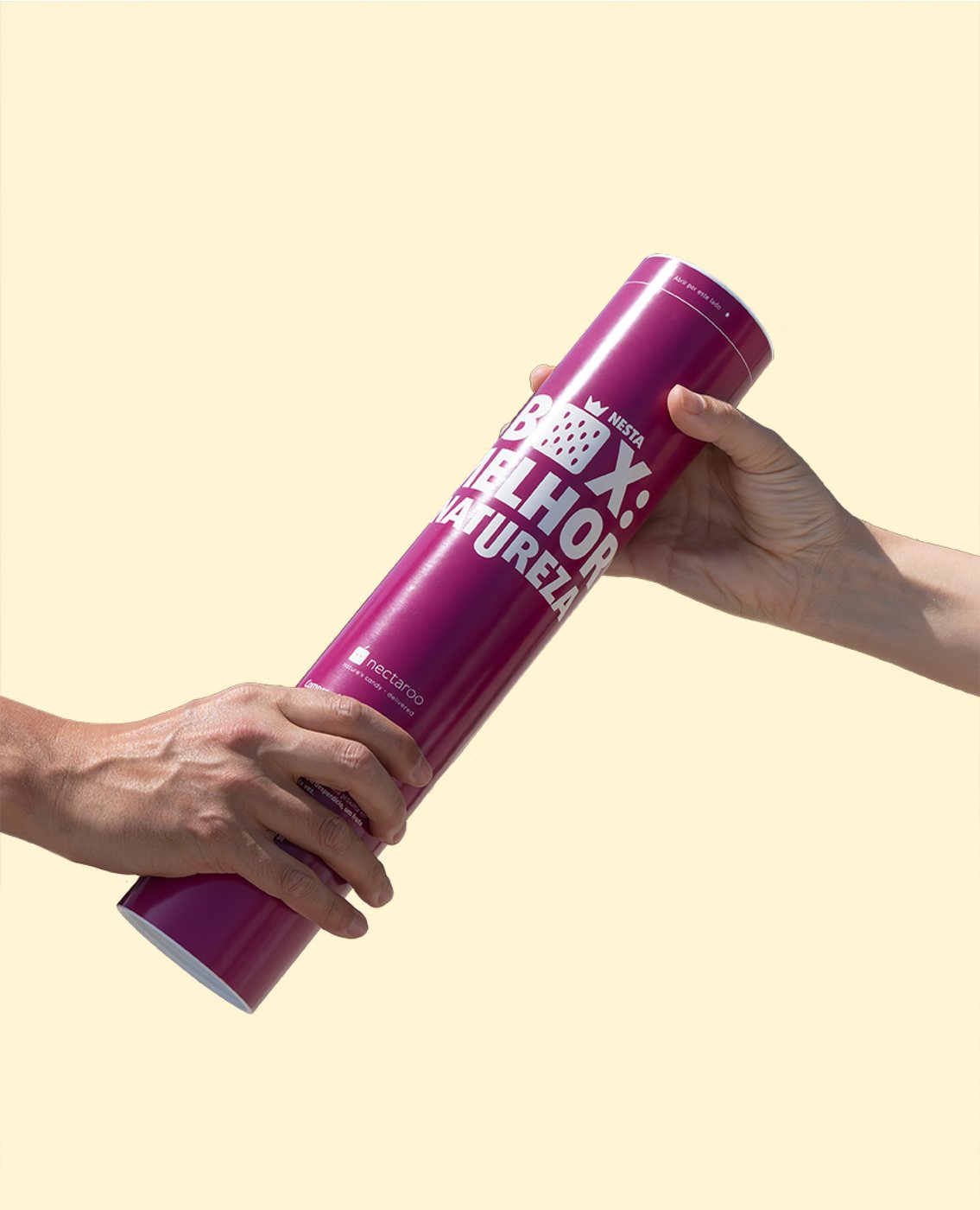
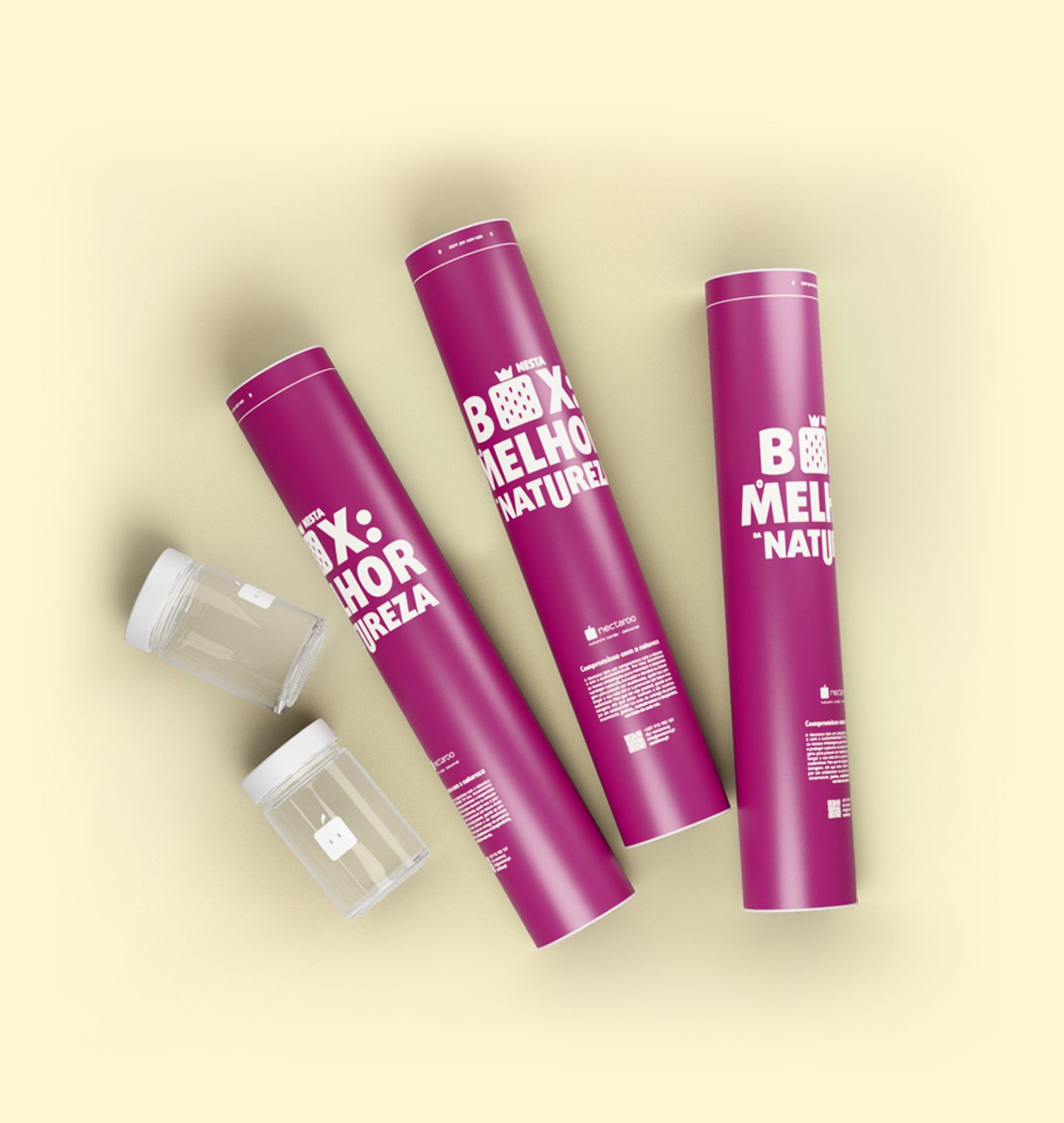
Packaging
Packaging
ResultA brand with a spine. Because positioning and messaging were settled first, everything after it (name, voice, look, packaging) held together and said the same thing. The clearest proof I have that strategy is the product, and the design is just that strategy made visible.

III. Lethean

Naming & Product UX/UI
Problem

Lethean (LTHN) is a privacy network and cryptocurrency: a decentralised VPN for browsing, transacting and moving data without surveillance. The category is noisy with coins and VPNs all shouting the same three words, secure, anonymous, private. Lethean needed a name that carried its whole meaning, and a product interface that felt as serious as the promise.

Strategy

It started with the name. From Lethe, the river of oblivion, I mapped the mythology onto the product: oblivion becomes anonymity, Hades’ Helm of Invisibility becomes the cloak, and Hades as god of the wealth below the earth becomes the metaphor for a currency mined from below. One coined word, Lethean, holds all three. That same idea set the tone for the interface: nothing decorative, nothing hidden.

Solution

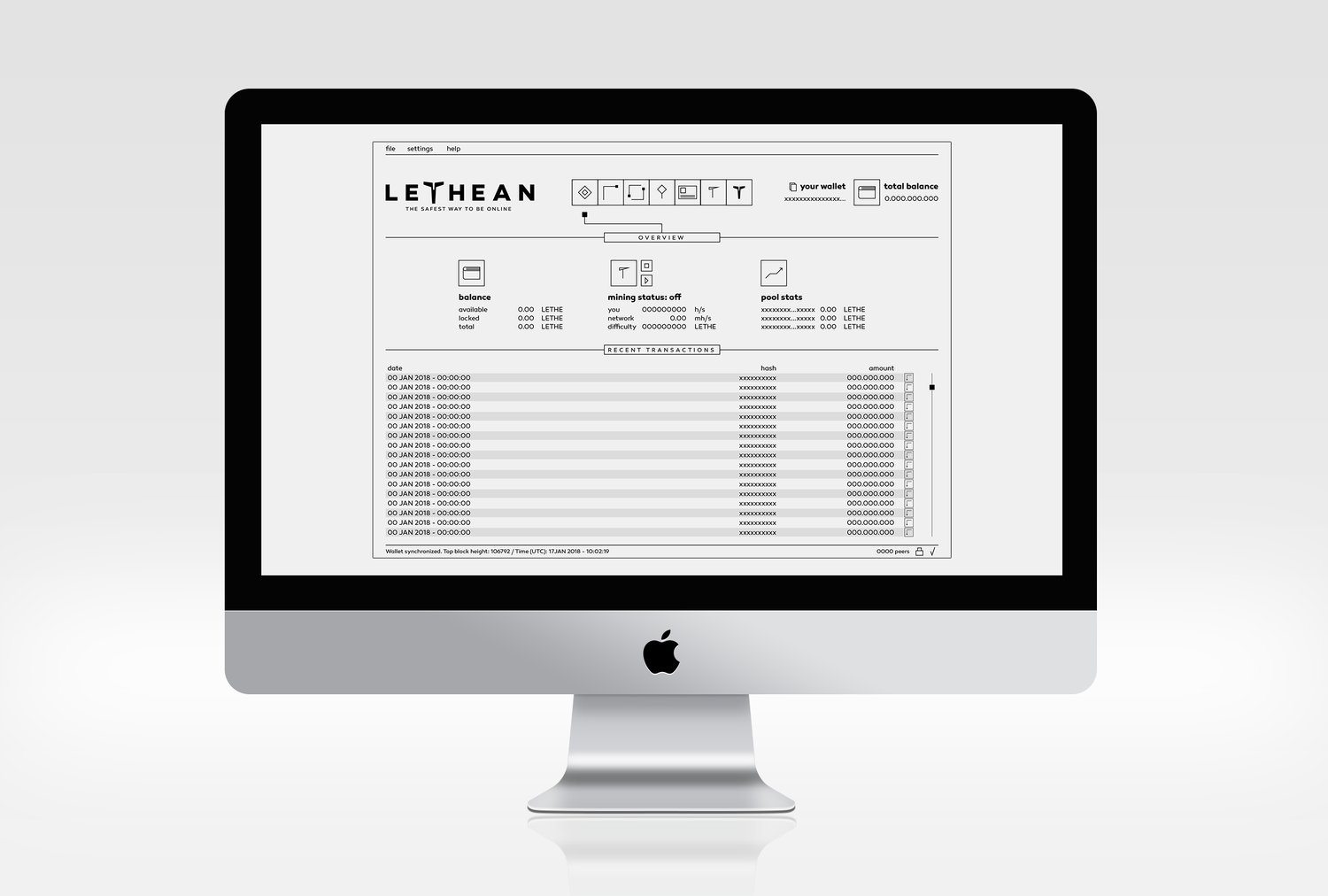
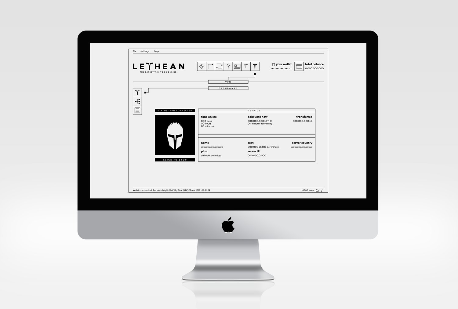
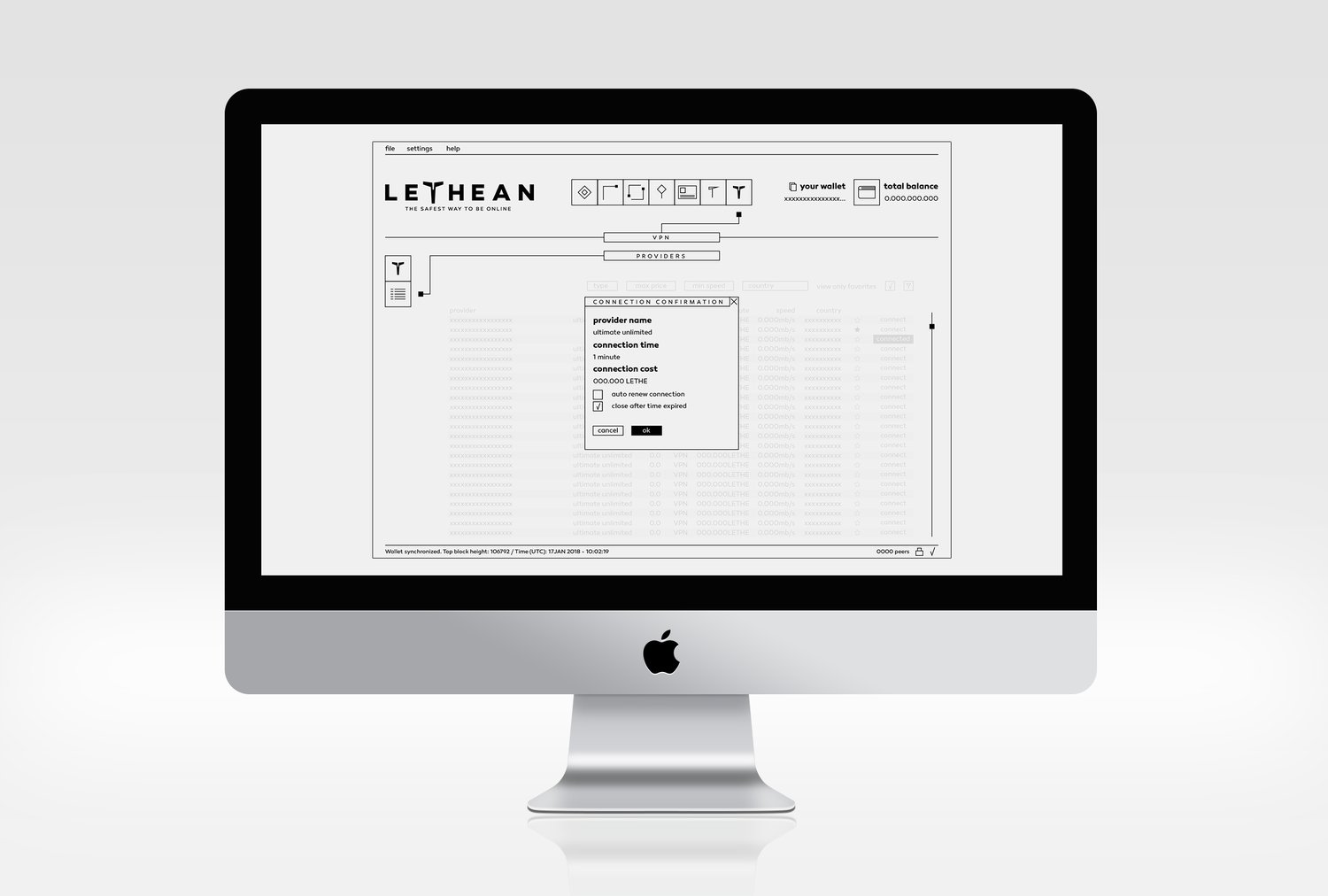
A full desktop wallet and VPN client designed as a minimalist, almost brutalist system. Black and white, hairline rules, dense but legible data tables, and a custom icon set. The Helm of Invisibility runs from the name straight into the product as its hero symbol. Dashboards, provider tables, connection flows and account states, all built to make a technical, data-heavy product feel calm and trustworthy.

Scope
  • Brand Strategy
  • Naming
  • Logo Design
  • Art Direction
  • UX/UI Design
  • Icon Design
  • Editorial Design
  • Motion Design
Lethean logotype Lethean wallet, overview and pool stats Lethean VPN connected, Helm of Invisibility Lethean providers table with connection confirmation
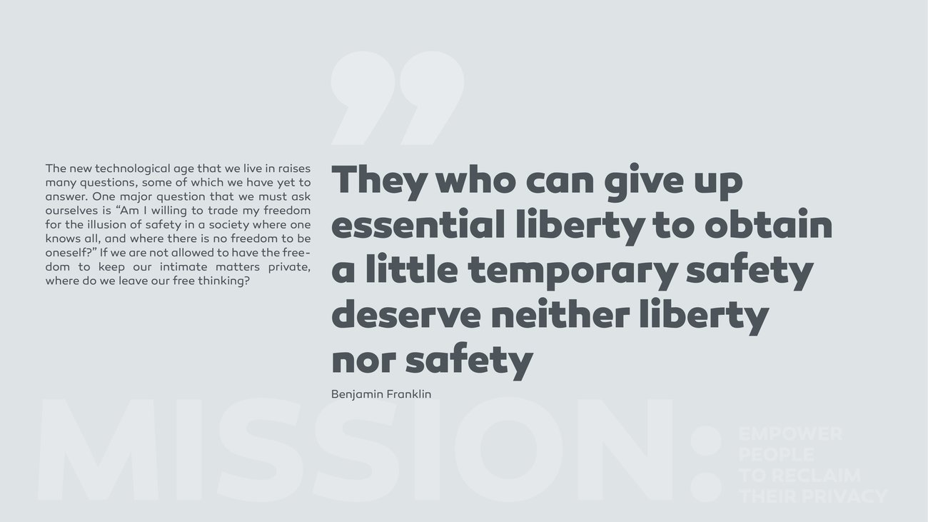
Manifesto coverVPN whitepaper cover
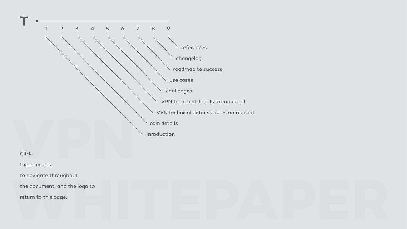
Manifesto spreadWhitepaper diagram
ResultConcept, name and interface speaking with one voice. The thinking you can see in the naming carries all the way down to the last data row, which is the real test of a system. It still holds when you reach the pixels.

IV. UNITEL

Exhibition & Spatial
Problem

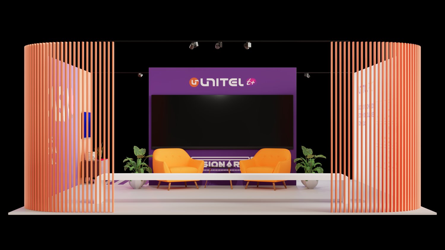
Unitel S.A. is one of the largest telecom operators in Africa, with a branch in Cabo Verde. This project was my intervention for the Cabo Verde branch: a stand for FIC, the country’s international fair. A fair floor is a fight for attention, and most stands are generic boxes that could belong to anyone. Unitel needed a space that was unmistakably theirs and gave visitors a reason to stop, sit and stay.

Strategy

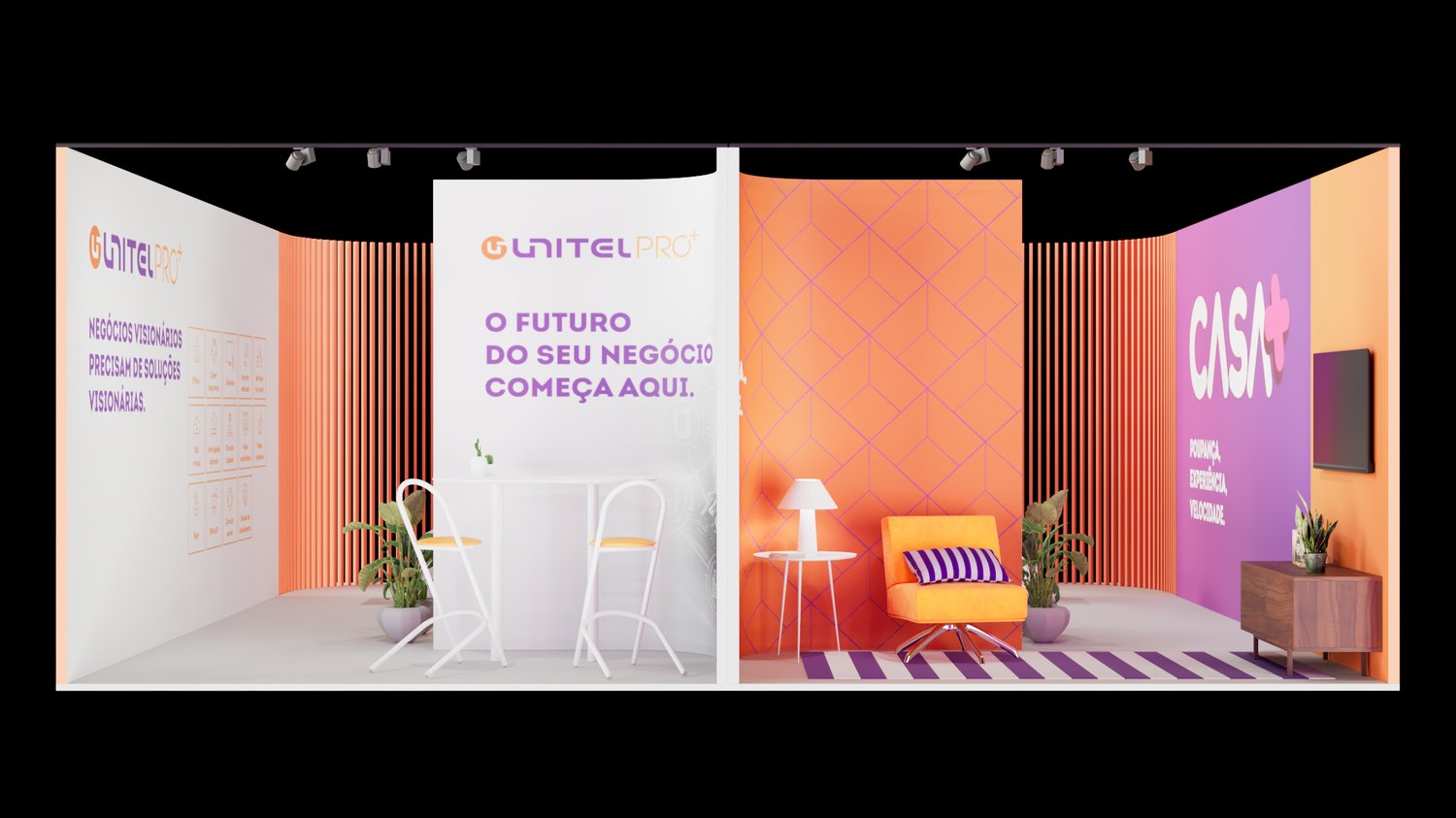
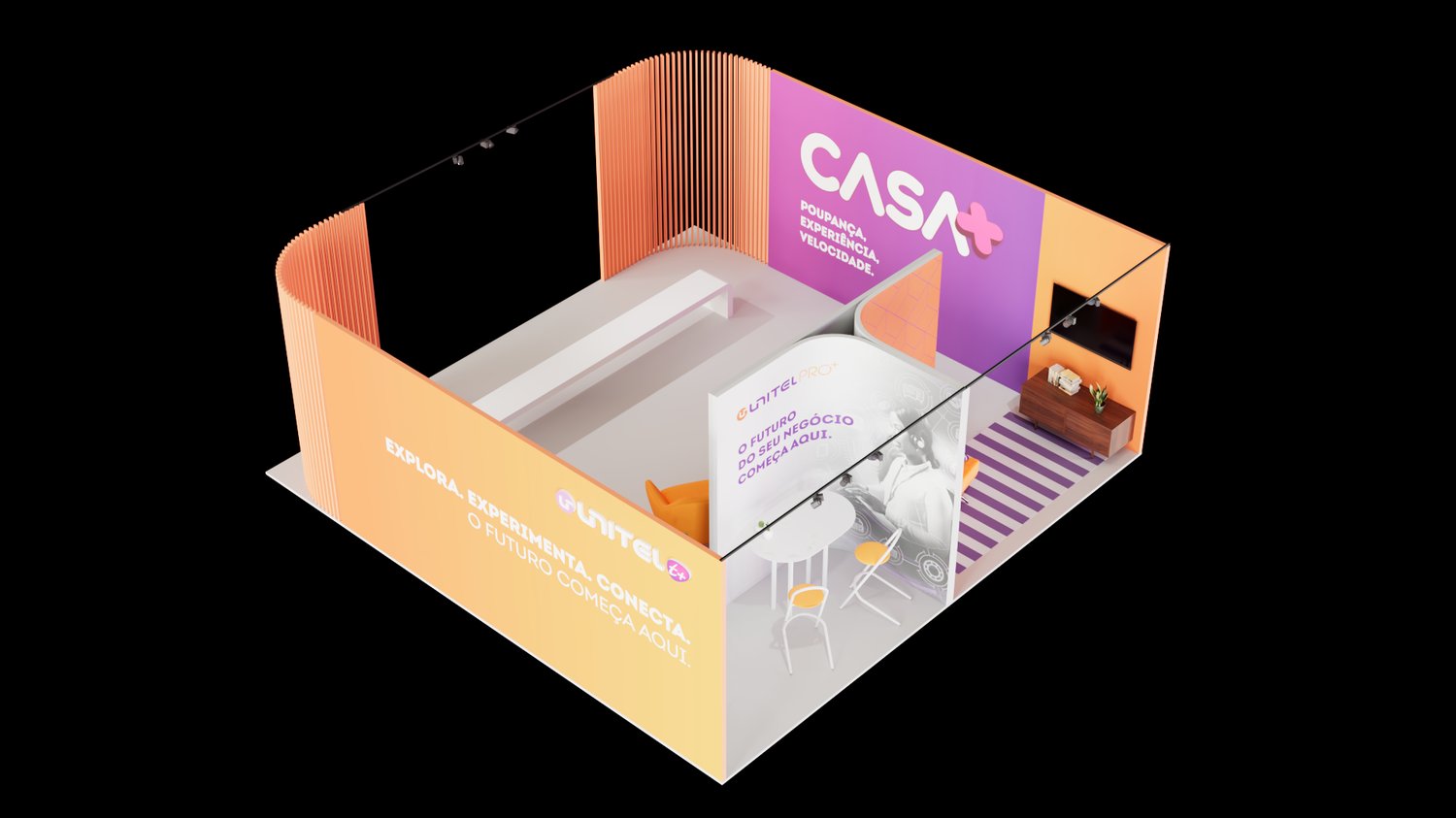
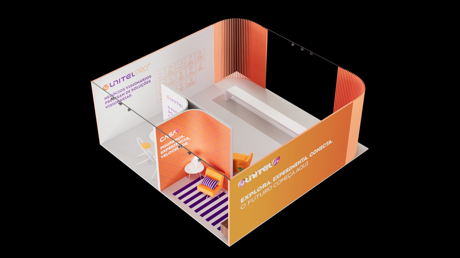
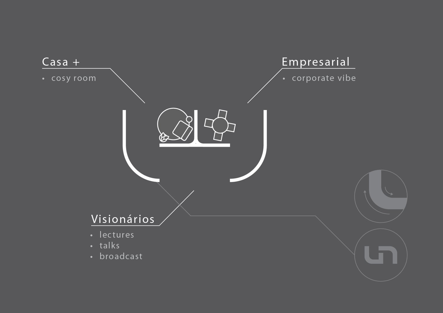
Start from the brand, not a blank booth. I took the curves of the UNITEL logo and used them as the generative line for the entire layout, so the architecture itself carries the brand. Then I split the space into three zones that mirror how people actually meet the network: Casa (home), Escritório (business) and Visionários, a small stage for talks streamed and broadcast live from the floor.

Solution

A warm, human stand built from curved vertical fins in UNITEL’s orange and purple. Casa is a living-room vignette, Escritório a business corner around the line “o futuro do seu negócio começa aqui,” and Visionários an on-brand stage that turned the booth into a broadcast studio for the run of the fair. The UNITEL brand is the client’s; the exhibition concept and stand design are mine.

Scope
  • Exhibition & Stand Design
  • Spatial Design
  • Environmental Graphics
  • 3D Visualisation
UNITEL stand, full elevation across the three zones Visionarios stage, streamed talks Casa zone Escritorio zone Concept sketch, croqui
ResultA stand that read as UNITEL from across the hall and worked as three experiences in one: a home, an office and a stage. The logo did not just sit on a wall, it became the shape of the room.
Where I'd take you next

Generative design

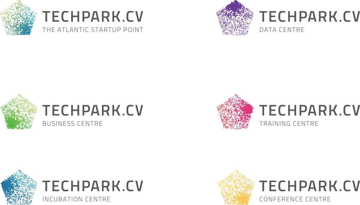
Generative, or procedural, design means building a system instead of a single artwork. We write the rules, the parameters and the inputs (data, motion, maths), and the system draws the result. Because it runs on rules it is controllable and endlessly reproducible: infinite variations that are all unmistakably one brand.

To be clear, this is not AI prompt-to-video. Nothing here is guessed from a text prompt. Every frame is the output of a system we built, driven by real inputs. In the mark below, a network of nodes (people, devices, connections, the whole ecosystem) assembles into the logo. Change the inputs and the mark redraws itself, still the same brand.

Concept and generative system for a technology-park client. Shown to demonstrate the approach and its potential, not a finished house style. Shared in confidence.

What drives the system is real input. The particles’ motion, size, density and colour respond to the volume of data moving through the park’s network. That is not decorative: some of the world’s largest submarine cables land in Cabo Verde, making the country a quiet nerve centre of Africa’s connectivity. The mark makes that visible, and the more data flows, the more the identity comes alive.

Every run of the system produces a different mark. Same rules, infinite outcomes, all unmistakably one brand.

Generated logo variations

Taken to its logical end, everyone in the company can carry their own version of the mark. No two identical, all unmistakably Techpark: a personal logo, generated on demand.

Business card, generated markBusiness card, generated mark

The same system, applied: a living email signature.

For a company built on data and AI, the opportunity writes itself: an identity generated from your own data. Never the same twice. Always unmistakably you.

Private presentation · please don’t distribute